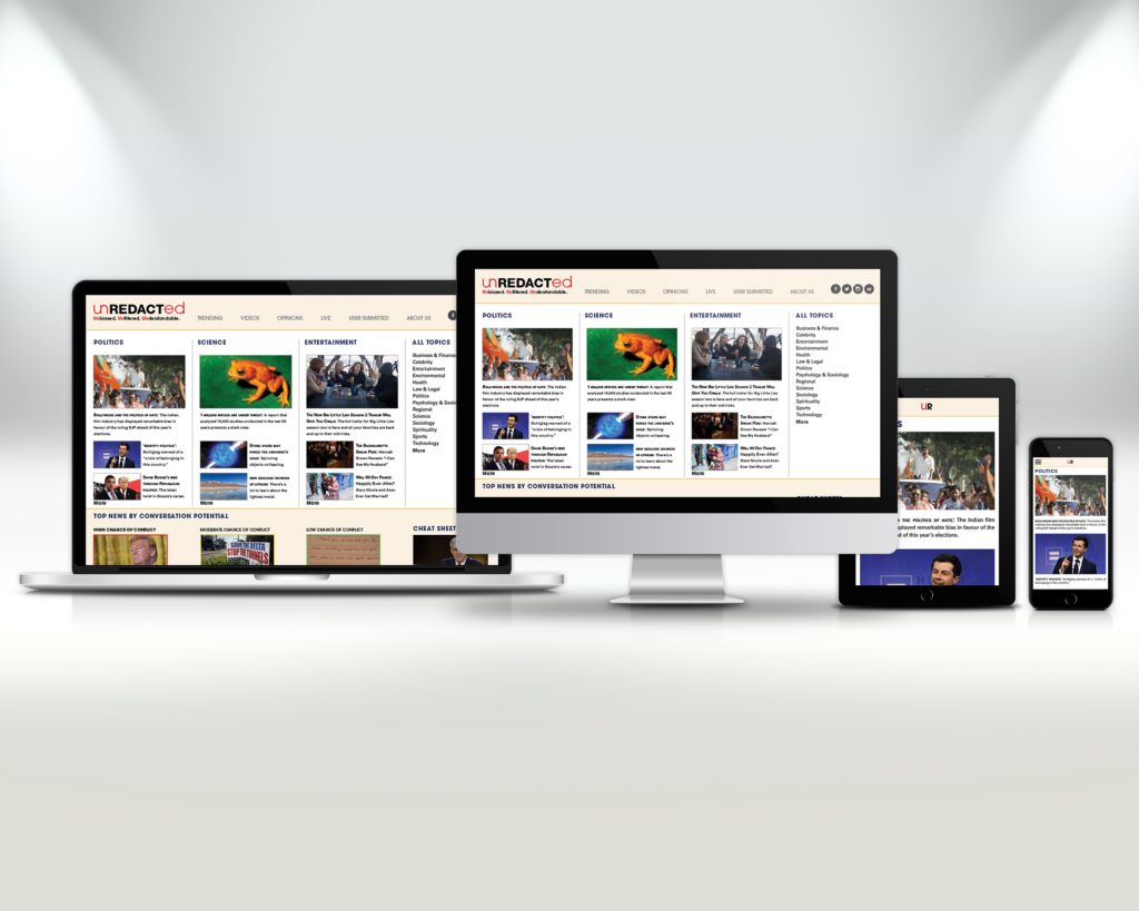
From Bias to News
Project Description
In this project, we were asked to design a news site. We also explored the semiotic possibilities of typefaces by designing a wordmark, and discovered how grids and type behave in online spaces.
Project Concept & Design Goals
When developing my type of news site, I wanted to build it around the idea of having bias free news. I organized the content to frame it in terms of how biased or controversial said topic might be when discussing it with other people. Staying on track with bias free, I also wanted a relatively neutral but still friendly look, so I based my color scheme and type choice off of that. I also developed sections like “cheat sheets” or “just the facts” to appeal to audiences that might not be so informed. Therefore, my visual system used a bright and bold color scheme and dynamic visual elements.
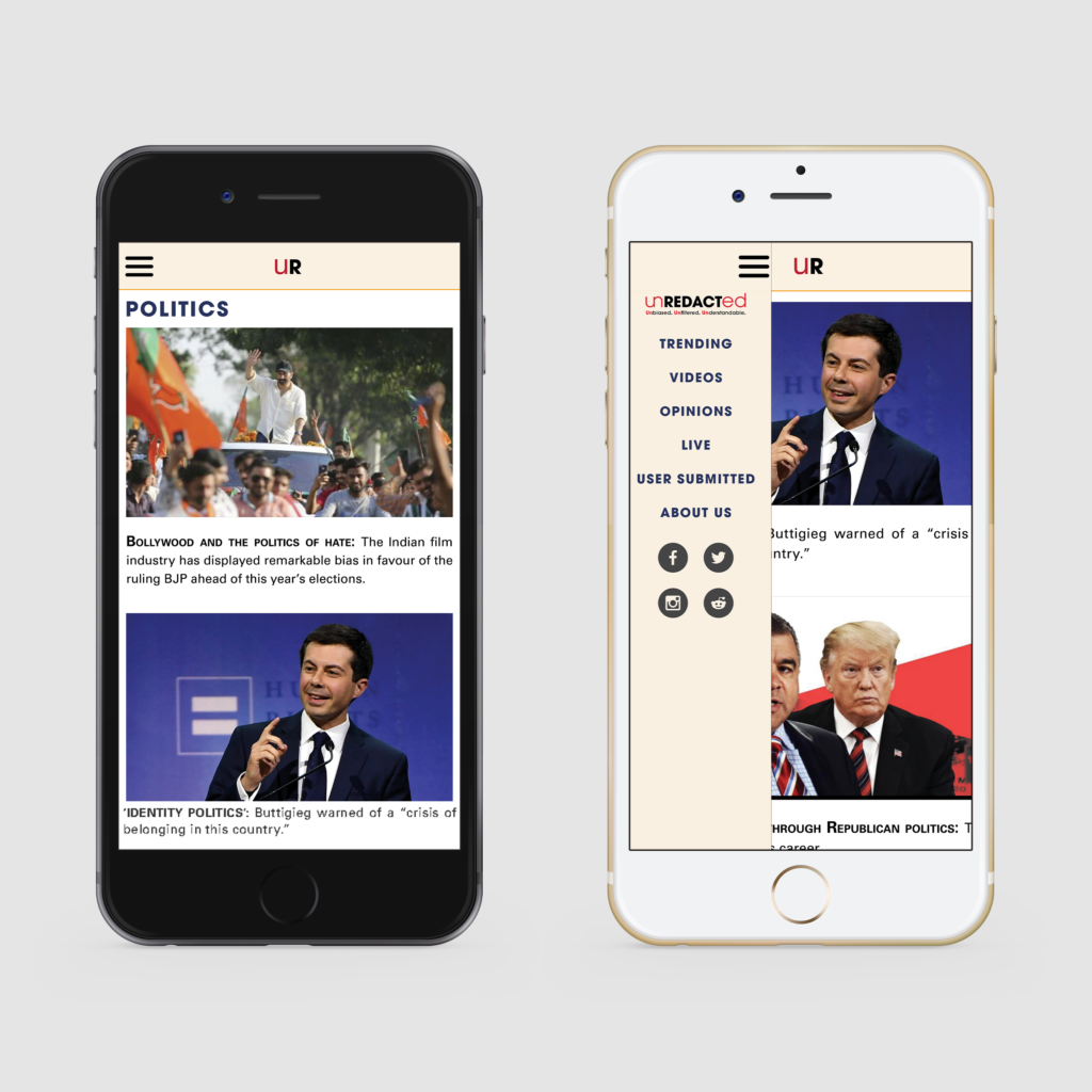
*Working Prototype App*
Interactive elements are indicated by the green boxes